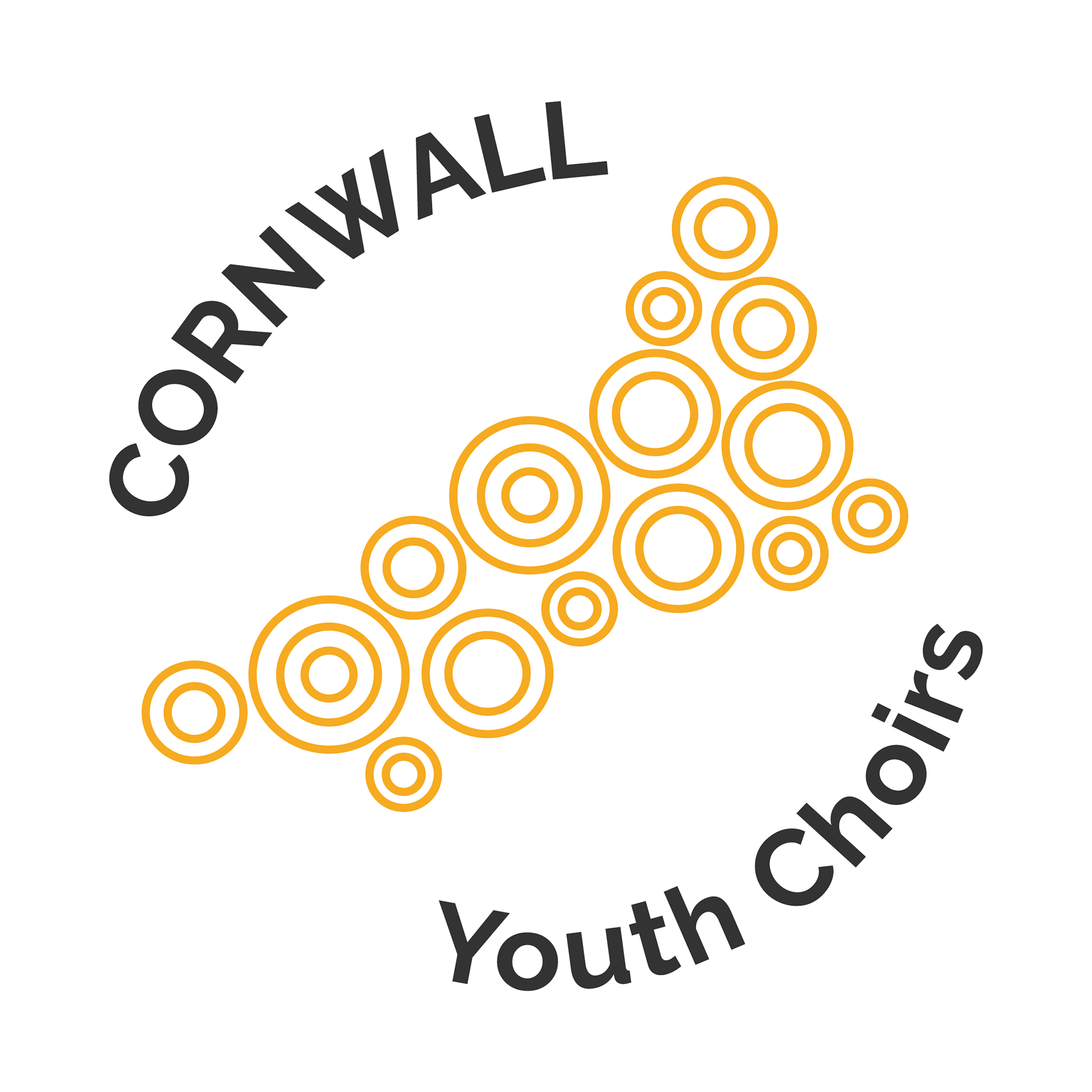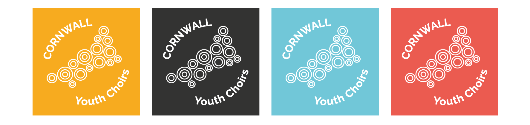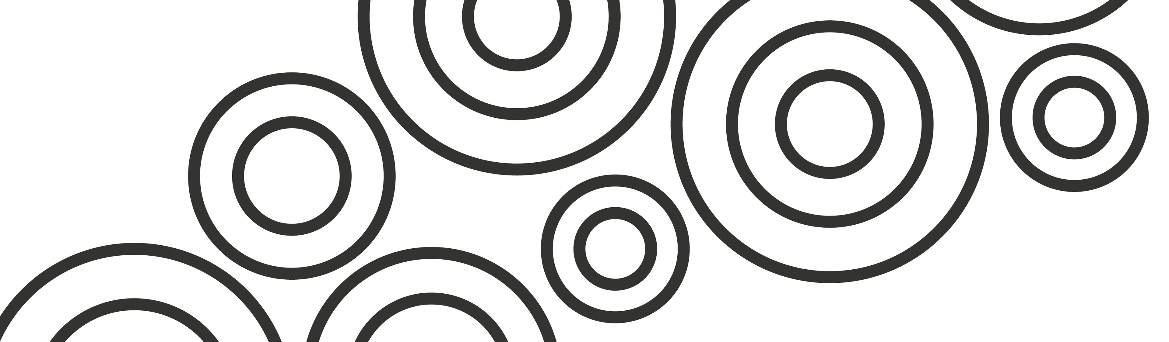
The new logo is an abstract representation of the map of Cornwall, made of circles which evoke the units - the voices - that build the wholesome of the choir coming together from various parts of the county. The various dimensions represent the different age groups participating in the choir and the concentric circles symbolise the growth and the sense of care and community.
The Cornish tartan inspired the colour palette: gold for the old Cornish kings, black for the banner of Saint Piran, red for the beak and legs of the Cough bird and blue for the sea. The territory plays a big part in this brand identity.
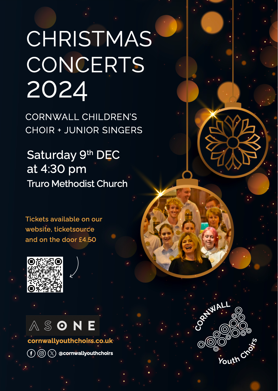
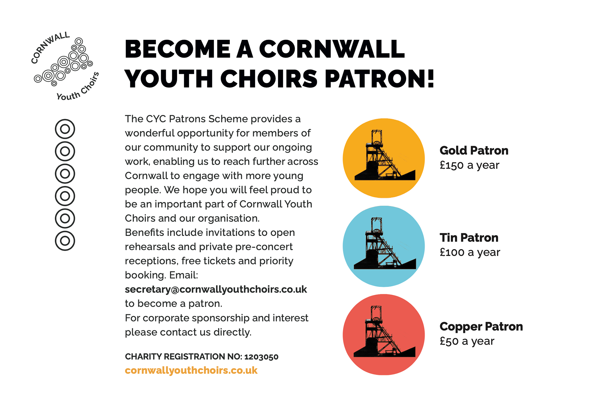
cornwallyouthchoirs.co.uk
The Cornish tartan inspired the colour palette: gold for the old Cornish kings, black for the banner of Saint Piran, red for the beak and legs of the Cough bird and blue for the sea. The territory plays a big part in this brand identity.
cornwallyouthchoirs.co.uk